The type of classification method chosen when visualising deprivation measure scores as choropleth maps can
drastically affect the output map, and the interpretation of the map. Try visualising the Index of Multiple Deprivation 2018 (IMD18) and New Zealand Deprivation Index 2018 (NZDep18)
using the different classification methods. Click on the layers tab within each map frame and select/unselect the layers
to visualise different classification methods on the map.
Note that the geometry of the polygons has been simplified to aid
rendering. Boundaries are indicative only.
The IMD18 Ranks and NZDep18 Scores have been rescaled to range between 1 to 100, to aid comparability between
the two measures.
Here one example Data Zone has been selected, in the Northland Region of New Zealand. The domains of deprivation,
and the corresponding NZDep18 score for the Data Zone, can be visualised using different techniques.
Bar chart
Rose plot

Three visualisation options for the two rescaled datasets (IMD18 and NZDep18). Values are averaged across the region, for District Health Board areas (DHB).
Rescaled IMD18
Rescaled NZDep18
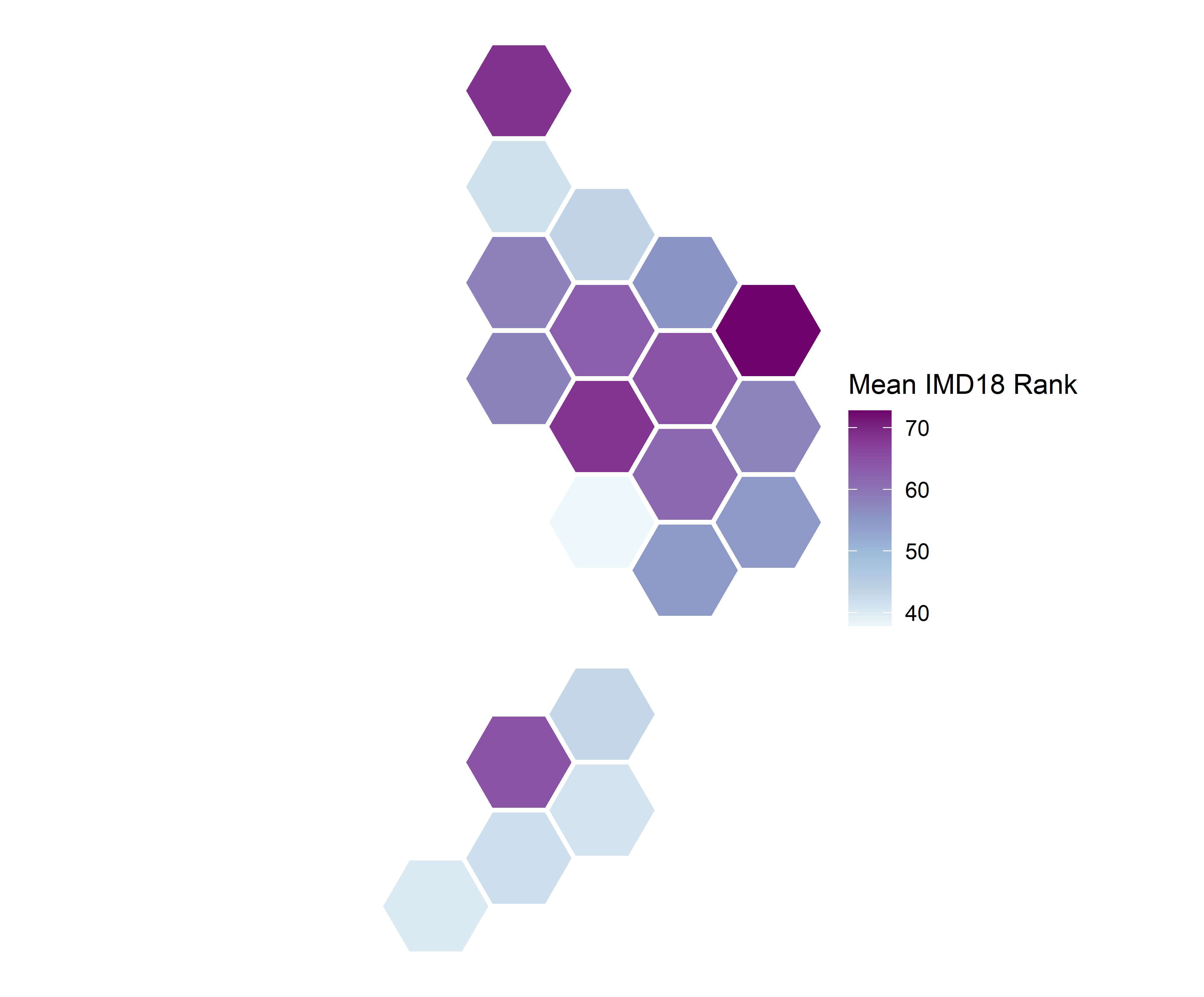
Cartograms can be used as an alternative to standard choropleth mapping, where the underlying spatial units
of the data are altered in shape and size to reflect the population density of the spatial unit. Here, we have used
the rescaled IMD18, and visualised the mean Rank across District Health Board (DHB) spatial units. The underlying units have been converted
to different types of cartograms based on the 2018 Census population of the DHB.
The first three tabs are interactive, the DHB name will be displayed when hovering, further information on the mean rescaled rank and population sum of the DHB is provided when the DHB is clicked on.
The first three tabs are interactive, the DHB name will be displayed when hovering, further information on the mean rescaled rank and population sum of the DHB is provided when the DHB is clicked on.
There are many ways to visualise multiple variables, such as the 7 domains of the IMD18, which still
include space. For example, here are two static multivariate visualisations of the rescaled IMD18 domains visualised by DHB.

Multi-variate visualisations can also be presented using interactive mapping and visualisation.
Zoom in and out of the maps to see greater detail, and click on elements of the graphics to see further information
on the multiple variables.
The visualisations in this tab use the rescaled IMD18 Rank and Domains. The interactive bar charts and rose plots
display this information averaged by DHB, and the basemap is of the DHB areas. The interactive chernoff faces display the
IMD18 Rank and Domains at the 2018 Data Zone level, and the basemap is of the Data Zone polygons.
The interactive deprivation flowers display the IMD18 Rank and Domains at the 2018 Data Zone level, and the basemap is of the Data Zone polygons.
Shiny application and visualisations created by Jessie Colbert, Daniel Exeter and Katarzyna Sila-Nowicka, 2024, The University of Auckland.
The authors wish to acknowledge the Centre for eResearch at the University of Auckland for their help in facilitating this research, in particular Nick Young and Noel Zeng. http://www.eresearch.auckland.ac.nz
The interactive chernoff faces visualisation is hosted on GitHub. Code can be viewed at https://github.com/UoA-eResearch/NZIMD_chernoff_faces/
The interactive deprivation flowers visualisation is hosted on GitHub. Code can be viewed at https://github.com/jcol737/deprivation_flowers/

Data sources New Zealand Index of Multiple Deprivation 2018 (IMD18): https://hgd.auckland.ac.nz/data/#IMD18-data New Zealand Deprivation Index 2018 (NZDep18): https://www.otago.ac.nz/wellington/research/groups/research-groups-in-the-department-of-public-health/hirp/socioeconomic-deprivation-indexes-nzdep-and-nzidep-department-of-public-health District Health Board 2015: https://datafinder.stats.govt.nz/layer/87883-district-health-board-2015/ Statistical Area 1 2018 boundaries: https://datafinder.stats.govt.nz/layer/92210-statistical-area-1-2018-generalised/
This work is based on/includes Stats NZ's data which are licensed by Stats NZ for reuse under the Creative Commons Attribution 4.0 International licence.
The authors wish to acknowledge the Centre for eResearch at the University of Auckland for their help in facilitating this research, in particular Nick Young and Noel Zeng. http://www.eresearch.auckland.ac.nz
The interactive chernoff faces visualisation is hosted on GitHub. Code can be viewed at https://github.com/UoA-eResearch/NZIMD_chernoff_faces/
The interactive deprivation flowers visualisation is hosted on GitHub. Code can be viewed at https://github.com/jcol737/deprivation_flowers/
Data sources New Zealand Index of Multiple Deprivation 2018 (IMD18): https://hgd.auckland.ac.nz/data/#IMD18-data New Zealand Deprivation Index 2018 (NZDep18): https://www.otago.ac.nz/wellington/research/groups/research-groups-in-the-department-of-public-health/hirp/socioeconomic-deprivation-indexes-nzdep-and-nzidep-department-of-public-health District Health Board 2015: https://datafinder.stats.govt.nz/layer/87883-district-health-board-2015/ Statistical Area 1 2018 boundaries: https://datafinder.stats.govt.nz/layer/92210-statistical-area-1-2018-generalised/
This work is based on/includes Stats NZ's data which are licensed by Stats NZ for reuse under the Creative Commons Attribution 4.0 International licence.